Skip to around 4:50 to see California’s magnetic pull — first centered on San Francisco, then on Los Angeles — as it draws migrants from the eastern seaboard as if they were iron filings.
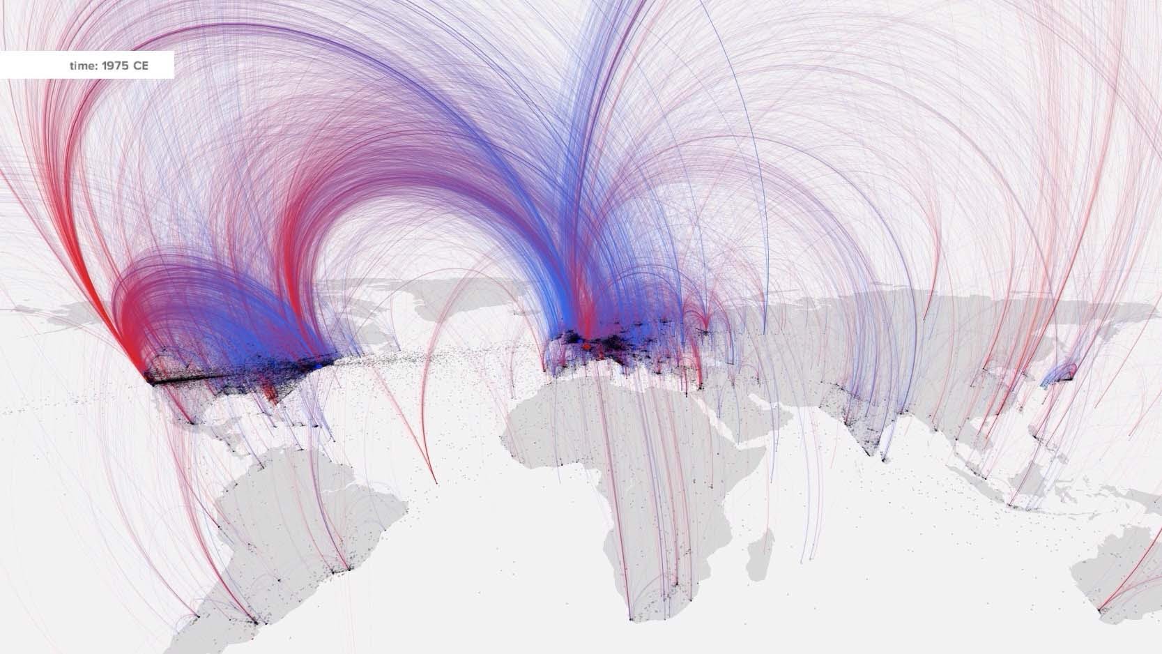
This animation distils hundreds of years of culture into just five minutes. A team of historians and scientists wanted to map cultural mobility, so they tracked the births and deaths of notable individuals like David, King of Israel, and Leonardo da Vinci, from 600 BC to the present day. Using them as a proxy for skills and ideas, their map reveals intellectual hotspots and tracks how empires rise and crumble. The information comes from Freebase, a Google-owned database of well-known people and places, and other catalogues of notable individuals. (YouTube)
See also: original Nature news story, full paper in Science.
Data viz of “cultural mobility” http://t.co/hyLW40kWCM *skip to 4:50 to see striking exodus from eastern seaboard to SFO and LAX in 20th c.